The success of deep learning is a testament to the power of statistical correlation: if certain image features are consistently correlated with the label “cat”, you can teach a machine learning model to identify cats.
But sometimes, correlation is not enough; you need to identify causation. For example, during the COVID-19 pandemic, a retailer might have seen a sharp decline in its inventory for a particular product. What caused that decline? An increase in demand? A shortage in supply? Delays in shipping? The failure of a forecasting model? The remedy might vary depending on the cause.
Earlier this month, at the International Conference on Artificial Intelligence and Statistics (AISTATS), my colleagues and I presented a new technique for identifying the causes of shifts in a probability distribution. Our approach involves causal graphs, which are graphical blueprints of sequential processes.
Each node of the graph, together with its incoming edges, represents a causal mechanism, or the probability that a given event will follow from the event that precedes it. We show how to compute the contribution that changes in the individual mechanisms make to changes in the probability of the final outcome.
We tested our approach using simulated data, so that we could stipulate the probabilities of the individual causal mechanisms, giving us a ground truth to measure against. Our approach yielded estimates that were very close to the ground truth — a deviation of only 0.29 according to L1 distance. And we achieved that performance even at small sample sizes — as few as 500 samples, drawn at random from the probability distributions we stipulated.
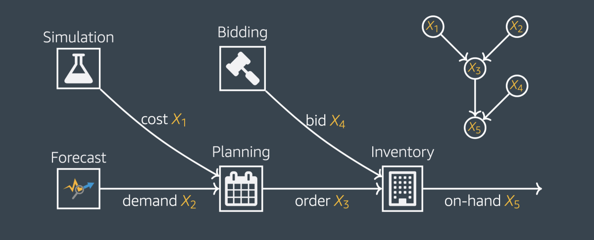
Consider a causal graph, which represents factors contributing to the amount of inventory that a retailer has on hand. (This is a drastic simplification; the causal graphs for real-world inventory counts might have dozens of factors, rather than five.)

Each input-output relation in this network has an associated conditional probability distribution, or causal mechanism. The probabilities associated with the individual causal mechanisms determine the joint distribution of all the variables (X1-X5), or the probability that any given combination of variables will occur together. That in turn determines the probability distribution of the target variable — the amount of inventory on hand.
A large change to the final outcome may be accompanied by changes to all the causal mechanisms in the graph. Our technique identifies the causal mechanism whose change is most responsible for the change in outcome.
Our fundamental insight is that any given causal mechanism in the graph could, in principle, change without affecting the others. So given a causal graph, the initial causal mechanisms, and data that imply new causal mechanisms, we update the causal mechanisms one by one to determine the influence each has on the outcome.

The problem with this approach is that our measurement of each node’s contribution depends on the order in which we update the nodes. The measurement evaluates the consequences of changing the node’s causal mechanism given every possible value of the other variables in the graph. But the probabilities of those values change when we update causal mechanisms. So we’ll get different measurements, depending on which causal mechanisms have been updated.
To address this problem, we run through every permutation of the update order and average the per-node results, an adaptation of a technique from game theory called computing the Shapley value.
In practice, of course, causal mechanisms are something we have to infer from data; we’re not given probability distributions in advance. But to test our approach, we created a simple causal graph in which we could stipulate the distributions. Then, using those distributions, we generated data samples.
Across 100 different random changes to the causal mechanisms of our graph, our method performed very well; with 500 data samples per change, it achieved an average deviation from ground truth of 0.29 as measured by L1 distance. Our ground truth is at least a 3-D vector (6-D at most), with at least one component whose magnitude is at least one (five at most). Therefore, a 0.29 L1 distance in the worst case is still a relatively small distance from 1.
We tested different volumes of data samples, from 500 to 4,000, but adding more samples had little effect on the accuracy of the approximation.
Internally, we have also applied our technique to questions of supply chain management. For a particular family of products, we were able to identify the reasons for a steady decline in on-hand inventory during the pandemic, when that figure had held steady for the preceding year.


