On the demand-forecasting team in Amazon’s Supply Chain Optimization Technologies (SCOT) organization, we often use data visualization to help understand customer buying patterns, so we can decide how much inventory to buy and where to store it. A good data visualization can save hours, days, or even weeks of development time by providing insights that would be hard to glean from purely numerical summaries of data.

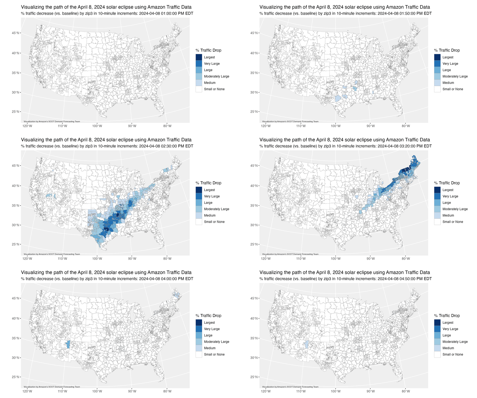
This week, we had an opportunity to use our data visualization expertise to trace the path of the 2024 North American solar eclipse. We measured traffic to the Amazon website on eclipse day, April 8, during the roughly four-hour passage of the eclipse across the US, at a “zip3” spatial resolution (that is, using the first three digits of a zip code). Our hypothesis was that during the eclipse, people would pause their daily routines (including online shopping) to go outside and look at the sky. Comparing our eclipse-day traffic measurements to a baseline level, measured from prior, non-eclipse dates, confirmed our hypothesis: we could easily trace the path of the eclipse, from Texas to Maine.
To make things more interesting, we animated our visualization by binning our data into 10-minute bins. The result was the animation above, which shows traffic anomalies to our website between 1:00 p.m. and 5:00 p.m. EDT on Monday. The movement of the moon across the eclipse path in the US is easily visible!
This is just one example of how well-crafted visualizations can bring data to life and instantly yield information that would be hard to extract from even the most sophisticated numerical summary.


