[Editor's note: Jared Wilber left his role as an Amazon Web Services data scientist to launch a new company in June 2023.]
In 2012, a Harvard Business Review article called data science “The Sexiest Job of the 21st Century.” Although the headline might seem hyperbolic, it’s easy to understand why business executives swoon over data science.
“It's serious, it's exploding, and that’s a good thing. Data science could be used everywhere, and I think that explosion is why we want to make content to explain the concepts,” says Jared Wilber, an Amazon Web Services (AWS) data scientist.
Wilber has a special, perhaps unique, role in the company. As part of his work on the Machine Learning University team, he helps create visual explainers that help others gain understanding of machine learning’s foundational concepts.
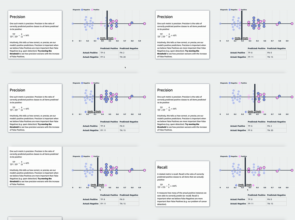
His team recently launched MLU Explain, a public website containing visual essays that incorporate fun animations to explain machine-learning concepts in an accessible manner.
“Learning machine learning is hard, and depending on your background, multiple barriers to entry exist. It requires a lot of assumed prior knowledge in subjects such as mathematics, statistics, computer science,” he says. “It's often presented in unengaging formats, and interacting with and building intuition around machine learning systems requires specialized software configuration. The concepts are difficult, but interactive articles help make learning them easier.”

Wilber’s educational animated explainers are all seasoned with more than a pinch of humor.
“The goal with using humor is to make the concepts behind machine learning as unintimidating as possible. Because a lot of these concepts are like walls of math when you first encounter them,” he says.
For example, to explain the concept of statistical tests, which are also known as hypothesis tests, Wilber helped create “The Permutation Test: A Visual Explanation.”
The hypothetical example — which foreshadowed his later creations for MLU Explain — leads the reader through a test to see which alpaca shampoo will lead to a higher quality of wool, with helpful animations of pink and blue alpacas (the color distinction has nothing to do with the sex of the cartoon animals).
Using this motif, Wilber guides the reader through the steps of randomization, response values, test statistics, permutation, test statistic distribution, p-values, and, finally, results. (In this instance, the new shampoo does improve the quality of the wool.)
The lure of Freakonomics
Wilber’s drive to explain things began, appropriately enough, in a library.
He first developed an interest in both statistics and graphics as an adolescent when he found himself spending extra time in his school’s library.
“My mom’s a teacher, and a single parent, so basically my twin brother Lucas, who is a software engineer at Amazon, and I had to wait for her after school in the school library,” he explained. “I read this book called Freakonomics, and I didn’t know it at the time, but it’s about behavioral economics. I was really infatuated with it. It had what are essentially data science case studies on unexpected topics like what are the effects of banning prostitution on the crime rate, or what incentive does a real estate agent have to reduce the price of your house to sell it as fast as possible?
“And I also discovered books on infographics that really held my attention at the time. There was a book that showed all the ships of ‘Star Wars’, and a National Geographic book with facts about the natural world. And I thought these cool explanations were really interesting.”
After high school, Wilber attended the University of California, Berkeley, where he worked at the Berkeley Institute for Data Science (BIDS), and graduated with degrees in statistics and computer science, before going on to work at two start-up companies. He discovered an appreciation for open-source work.
"At BIDS you had some very smart people working on really impactful open-source projects, like Project Jupyter, and that definitely left an impression on me. During an internship, I had a manager who encouraged me to contribute to any libraries in Python or R that our work overlapped."
But it was an unexpected sabbatical that resulted in Jared's favorite open-source project, roughViz.js — a data visualization library that lets users draw hand-drawn styled charts in the browser.
“I don’t want it to be a sob story, but I had heart surgery for something I was born with. I had a two- to three-month recovery period and I wanted to work on something fun and sharpen my skills.”
Pursuing a passion
Wilber grew up skateboarding, and so his first interactive article was a statistical explanation of how the use of music has changed in skating through the decades. That first interactive caught the attention of Matt Daniels, editor of The Pudding.
“Matt saw my article and reached out asking If I’d like to turn it into a larger interactive. I was shocked, because when it comes to data visualization, The Pudding is as good as it gets. Of course I said yes. They took me under their wing and showed me how they design and create interactive articles. They were incredibly nice and patient with me, and I’m super thankful for that opportunity."
That “pseudo internship,” as Wilber describes it, resulted in his first article for the publication, “The Good, the Rad, and the Gnarly”.
After that, Wilber says he monitored opportunities with large tech companies — and he had one in mind.
"I've always wanted to work for Amazon for two main reasons: they have tons of talent in engineering and science, and they have access to unparalleled resources on the hardware side."
Jared got that opportunity after seeing an interesting job online.
He applied and joined an HR research team focused on casual inference and machine learning. About a year later, Wilber heard about an interesting data visualization design position via an internal Slack channel.
“My current manager, Brent Werness, posted a message stating that his Machine Learning University team had just opened a new role to use data visualization to explain ML concepts. I must have messaged him within minutes, since the role combined my background in machine learning and my passion for data visualization.”
In his roughly two years on the MLU team, Wilber has worked in a number of capacities, but he might be proudest of his recent work on MLU-Explain.
“My hope is that the articles help anyone of any background understand or get interested in machine learning. I also think it’s important to try and push for better computational interfaces in educational contexts, and that these articles are a step in that direction.”
Wilber says that his ability to find a creative outlet in data science is the thing he loves, but the most fulfilling part of his role aligns with the company’s “Learn and Be Curious” leadership principle.
“Our team helps Amazon software engineers use machine learning for their tasks, so they can use AI in different ways to address customer needs,” he said. “But what’s really motivating is now we are externalizing much of our material so individuals who want to learn and are curious about machine learning can do so in a way that’s hopefully fun and engaging.”


